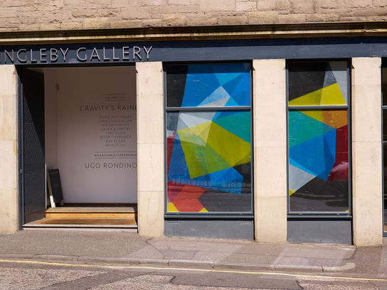
Cross Double-Cross (outside view, Ingleby Gallery)
Grace and Owens
2011
recycled polythene liners, condensation
The title of this exhibition is borrowed from that of a novel by the American writer Thomas Pynchon. We are grateful to David Batchelor for pointing out Pynchon’s use of ‘borrowed’ adjectives as imaginative prompts to suggest very specific and vividly recalled colours “drowned man green” for example, “deep cheap perfume aqua marine” or most expressively of all “creamy chocolate FBI-shoe brown”. Following Pynchon’s lead this is an exhibition about borrowed colour in which, in very different ways, colour is integral to each of the works, and may even be their subject, but which always originates elsewhere. “Found” colour, in other words, lifted or stolen from outside the studio.
The exhibition begins, in the display cabinets on the ground floor, with a facsimile copy of Yves Klein’s 1954 booklet Yves: Peintures. It was the first work that Klein ever exhibited, at the age of 26, made with his friend Claude Pascal at the printing shop of another friend’s father with funds from Klein’s aunt, and it purports to introduce to the world a series of paintings by the unknown artist ‘Yves’. The booklet, subtitled ’10 Planches en Couleurs’ presents ten horizontal rectangles of thin coloured paper, each glued onto a page, each pretending to be tipped-in reproductions of an actual paintings, but in reality being a found off-cuts of a commercial coloured paper. The joke is enhanced by Pascal’s Preface in the form of empty pages of ruled lines.
Three site-specific installations anchor the exhibition. The first is provided by Tommy Grace and Kate Owens whose temporary 'stained-glass' window transforms a section of the gallery’s glass frontage with panels made of coloured plastic bags, filtering the early summer sunlight and bathing the walls in a synthetic pool of colour.
In Gallery II , on the ground floor, Kay Rosen’s wall paintings are made from ordinary house paint layered in bars and rectangles to form a kind of modernist abstraction. The colours are chosen from the pages of a paint chart entirely on the strength of their quasi-poetic names and the evocative, if slightly ridiculous, phrase that these names create when gathered together. For example, Mud Hut between Willow Tree and Apple Tree beside Rocky Road separated by Hedgerow from Copper Canyon.
Upstairs in Gallery I Ian Davenport has also made a site-specific wall painting. Like Rosen, his choice of colour is found in the real world, in this case by deconstructing a painting by the 16th century painter Vittore Carpaccio into its colour components, and re-assembling it as a series of poured lines. His painting offers an alternative, and quite literal, reading of the exhibition’s title: paint flows in rivulets directly down the gallery wall, a rainbow of colours drawn by gravity towards the floor where it pools into a technicolour puddle.
Also in Gallery I, David Batchelor’s seven balls of colour are scattered across the floor, not quite the seven colours of the rainbow, but each one of them intricately wound from found electrical wires in different shades of blue, yellow, green, white, black, grey and orange.
Peter Liversidge’s take on colour is quite literally found: picked up on his travels, and on the seashore and on the street, over a three year period and assembled on a shelf – a series of random finds and fragments united only by their common colour; in this case an army of little yellow objects. He has then painstakingly re-made the objects out of clay and glue and plastic to make a not quite identical Doppelgänger.
Jonathan Callan’s colour is found in the hard covers of old books, sliced and rearranged into abstract reliefs, the monochromatic expanses of stripped back card broken by circles of unadulterated colour. Ed Ruscha’s seminal series of screenprints from 1970 also appear almost monochromatic at first glance, but the subtle shifts from brown to yellow are courtesy of colour found in the most unexpected, and deliberately obtuse materials…. in this case printed with chocolate syrup, tomato paste, bolognese sauce, cherry pie, coffee, caviar, axle-grease, daffodils, tulips and raw eggs. Ruscha titled the series News, Mews, Pews, Brews, Stews & Dues, six words chosen for their association with things British. He delighted in the fact that these most vibrant and varied organic colourings dried to a range of muted greys, mustards and browns.


